Amplified
magazine Evaluation
I think my
magazine went okay, I thought the pictures connected well to my magazines theme
as I was pictured in clothes that represent the hip- hop theme but also with a
bit of class .
My target
audience was aimed at hip-hop fans between the ages of 16 and 24 I think I have
achieved the target audience that I set for my magazine as it has articles
about up and coming artists and a classier side for the older type of readers.The target audience was aimed at one genre, but has targeted two different departments of the industry. The interview was made to represent a genre of people who like artists that have had a tough background and overcome this to become famous for their talents.
It is called
Amplified to link up with the idea of it being a music magazine. I have made
the font big so that you can see it and also it is in white to make it stand
out even more in front of the black background. It’s set at size 99 so when
readers look at it they will instantly see the title and remember the name of
the magazine.
I have used a picture of myself pictured as an urban hip –hop artist portraying
the character of J-Rhymes an up and coming rap artist, he is wearing a white
vest to further his imitation of a rap artist.
My slogan for my magazine is ‘Turn it up’ as this also connects to the name
Amplified. I have also put on the front cover that there is a free poster to
interest the reader so that it may make them want to buy this edition a bit
more.
My contents
page features a picture of me portraying a more stylish artist and covers half
of the page. The title Content is split into three to make it a bit more
interesting to look at. It then has the features in the magazine down the side,
with the featured headlines highlighted in red. I used the picture of me portrayed as a more stylish up market artist to capture that side of the industry for example Justin Timberlake he is in this genre of music and brings something else to it as he has performed as a pop artist and also in the hip-hop industry and has featured in a lot of big hip-hop stars songs.
My next page
is a feature that is about the interview with J-Rhymes, this includes questions
that ask him about past, present and future events that have happened in his
live or that might happen such as future link ups with other artists. It has a
title at the top of the page reading Question time this is shown in a big font
and is highlighted in red; it is similar to the symbol of Q magazine.
Gossip page this also has a big picture of me in a classy outfit and going down
the picture is some gossip that is in the magazine these are included in this section
of my magazine to interest the reader so they would like to buy and read it.
My magazine is priced at £2.99 this is not at the high end of magazine prices
and is affordable for most people to buy weekly.
The colour
theme of the magazine Is red ,black and white because these colours stand out
well from each other, and the black and white was meant to give the magazine a
bit more of a classier look and then the red bringing a bit of colour so the
magazine doesn’t look bland.
·
In what ways does your media product
use, develop or challenge forms and conventions of real media products
I researched
existing hip-hop magazines and found out that black, white, blue and red were the
most prominent colours on popular rap magazines. I have gone with the red, black and white as i thought this suited my magazines style better. I have used some of the ideas from Q magazine as they use this colour theme in all of their magazines and i have used this colour theme in some of my features on my magazine to help it stand out from other features on the magazine to show importance.
Seeing as my
target audience is the same as most other hip-hop magazines it is between 16
and 24 and males, I used the same colours on my magazine red, white and black
that are very bold colours that will attract readers as they make each other stand out and they also suit each colour very well. The pictures also linkwith this colour theme as they suited the colours well with the black and white of the suit and the vest on the front cover. I also like these colours
and thought they worked very well together as I like the class of black and
white with a suit and that was the idea for my contents page picture, I also
got the idea from magazines like Vibe and Q magazines as some of their front
covers have artists with suits on ; I like the thought that a person can come
up from a bad background and become a great person and this idea is brought
through by having rappers in suits as they have come up through tough
backgrounds, worked hard and have seen the benefits from it and this is shown
from the pictures of them in suits and that also gave me the idea for the
picture of me in the suit.
·
How does your media product represent
particular social groups?
In my magazine I am trying to represent the
social groups of new hip-hop artists and people who are heavily interested in
hip-hop.
I used representations of rappers when I was taking my pictures for my magazine
as I have represented myself as a hip-hop icon. I had created two different styles to the images as one i to represent the more urban side of hip-hop as he is stereotypically shown to be dressed with chains and rings on and also a gesture to where he is from, this is to connect with that style of hip-hop. Then there is the other style of image i have used this is a more classy look as he is picture in a suit, and this is to capture the different style of the hip-hop industry this helps to show the different genres in hip-hop and there are many different variations in this market. I wanted to create a character
who could relate to the target audience because from the stories that I’ve
heard about some rappers is that rapping helps them escape from the problems in
their life and create a place where they can be themselves ,it also helps them
to be more confident. My magazine represents particular social groups in the feature page where the interview of J-Rhymes is as he is portrayed to be froma rough background which is representing a social group and then in the present day he is obviously a rapper who now has enough money to live comfortably and well so my character represents two social groups. My magazine represent the hip-hop industry and insome parts the british grime indusrty onthe front cover as how he is dresses is how someone fromthat particular section of hip-hop would dress. I think thatthe coulours also help to represent social groups as they alot of people from the hip-hop indusrt wear mainly black and white colours and also red is a big feature in this.
·
What have you learn't about
technologies from the process of constructing this product?
I have bettered my
knowledge about using a canon 1100 d and the effects that come with this. I
have also found out how to crop pictures on Photoshop and how to edit pictures
on this program Ms Juan showed me how to edit these photos as she is a
specialist in this department. I can now do all of these movements to create an
improved image. I have seen the quality of the cannon compared to mobile phones and other cheaper cameras ,they are all good but the cannon produced the best picture quality and the right style for my pictures. A phones camera would of been good as it is more mobile and you can edit it on the phone instantly ,whereas you have to use an application on the computer like Photoshop to be able to edit the picture well enough to make it suit the magazine. I am now more confident when using word and photoshop when creating something as i have now developed many pieces of work and feel that i know the way around these sites and would be able to perform most of the commands on these applications. Ihave have alsolearned how to used Blogger as ihad not used this site before uploading my media work onto this, i have enjoyed learning all the ways to develop my work and making my page look as good as i can make it. I have also had to upload a lot of files onto my computer and blogger from my phone as i have taken some photos that way this has also made me more confident as ihad not uploaded a lot of work to my computer off of my phone before and this has helped me learn alot and i can now do this witha lot more accuracy and speed.
·
What kind of media institution would
distribute your media product?
Time Inc.
would be the institution that would distribute my magazine as my magazine would
have the same target audience as some of their other magazines for example Vibe magazine as these are both hip hop
magazines and are both aimed at the same target audience. Time Inc. has
published many big magazines before and a lot like mine so I think they would
be the sort of company that would be interested in publishing my product. I also think that these institutions would publishmy magazine as they have a similar sort of theme/colour theme sothis would make it easy for them to publish it as it is similar to whattheyare used to. I also have set my magazine at a cheaper price thana lot of the magazine thatthese publish, this maybe an advantage or a disadvantage as they might want a cheaper but similar magazine to widen their range and hit another type of audience. however they might not likethis idea as they may want to keep to what they know and stick to their prices because theymight feel they will be able to dobetter that way.
·
How did you attract/address your
audience?
I used my
font and colours to attract my audience by using three main colours Red, black
and white as these stood out well from each other ,I liked these colours and
thought these worked well together. I used the colour red on my magazine to portray the danger and passion of J-Rhymes and hopefully this would help attract/ address the audience as they may feel the passion of J-Rhymes in the interview as some of the quotes are highlighted in red.
I also used
my picture to attract my audience because my picture looks like Justin
Timberlake and that appeals to people and will make them want to buy my
magazine as it was done to look like him and attract a different type of viewers. My picture for my front page is also
used to address the audience as this picture is styled to look like a rapper
who is called J-Rhymes this picture is used to connect with what my target
audience would like. I also used my font attract readers by making it bolder
and enticing them with the colour red.
I have also used the range and variations of different styles of pictures to help the character link to the audience as it will help the viewers connect to the character as they are able to see the him in more than one photo, so this will help to build the relationship with the audience of my magazine and make it more appealing as you are seeing him in more than just one photoshoped picture that takes away the reality that is J-Rhymes.
·
Looking back at your preliminary
task, what do you feel you have learn't in progression from it to be the full
project?
From my
preliminary task I have learn't that I needed to edit my picture to make it fit
in with my background , this makes my magazine look more realistic as it gives it a more professional look. The pictures on my magazine have also changed sizes form my preliminary task as i have made most of them bigger to give the pictures a larger role in my magazines attraction of readers.
I have also added a gossip page to this to fill in the other side of the page
to make the two feature pages look like a realistic double spread of a
magazine.
I have also had to change my font a lot as my magazine has progressed to keep it up to date with the changing backgrounds and themes of the magazine; the colours of the font was also something i had to think over carefully when improving my magazine as i needed it to link with the magazine and the ideas of it in order for it to attract the right target audience and also it need to be the right colour to be able to stand out from the rest of the magazine. I have changed my feature page a lot form my last attempt as it now looks more like a double page spread and has more features on it which also makes it look more realistic, as most magazines that i had researched had more article on them which i have added.
I had also
changed the size of the text on my updated version of my magazine so it will
become clearer for people to see, I have also changed the font on the magazine
to make it look more appealing to people and so it would stand out more when
people are looking at the magazine, I made the font bold and put the colour in
red to go with the running colour theme of black, white and red. I have changed the font on my contents page as it suited it better as it changed the layout of the contents page.
I have also
learnt a lot from my first magazine that I had made as the colours are more
attractive and the pictures also fit in better with the theme of my magazine;
the colour theme also fits in well with the pictures that I have taken and the
way I edited it made the picture look more appealing for my target audience.
Overall I think that my magazine compliments the hip-hop/ rap industry as it
has highlighted some of the strengths of this genre and also exposed the truth
behind the music. I also think that if it were to be published it would work
well with the target audience as it is similar to other magazine that has been
published by Time Inc. I have also done a questionnaire and given itbto my target audience to get their views on magazines and what they think about what should be on there. From their results i have found that the most popular genre of music is Hip-Hop/Rap and this is good for my magazine as i have chosen this genre so this is very good as it's the right genre for my target audience. I also learned that most of them would like the magazine to be published monthly, however weekly was also a popular option as it gives them enough time to read the magazine a pay for the new one, they did not like the idea of having it daily as this may be to much for them and it would be hard on the publishers and they also did not loke the idea of yearly as that would be too long a wait for the next issue, if it was yearly the price would have to be driven up.
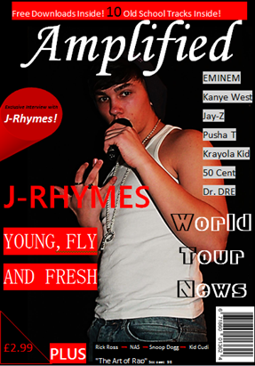


 One of the last features that i added what the " World Tour News" I done this to fill in the space bellow that highlighted artists names. I like this feature as it is large enough for the reader to notice, also i had to changed the colour of the first letter on each word as it makes the words stand out against the picture and the background this makes the words look better as well. Also i have added the three descriptive words of J-Rhymes to make him seem like he is an up and coming artist.
 This magazine is a good example of what i had pictured my magazine to be like as it has the same colour theme as mine, however the layout of it is different to mine but has some similar features. This magazine has used the idea of making its words bolder and then highlighting them to make them stand out. Also this magazine has tried to fill up most of the front cover with inviting titles and features of the magazine. My magazine has also used a large central image with similar characteristics of XXL's as they are both shown to be wearing chains and rings to represent where they are from. This magazine has a white background to it which i could i of tried out for my magazine as it has worked well for this magazine and we have a similar colour theme and picture. However i might of had to change the style of my title and strap-line if i done this to account for the white background to make this still fit in with the theme of the magazine.


 I based some of my photos on these styles of photos and these artists style as i thought it look classy and suited the way i wanted my magazines layout to be planned. The pictures are what i wanted to style my magazine on as it is a hip-hop magazine but i wanted to add some class to the genre and the way they are dressed; i tried to represent this in my photos.